Project of Visualization

Project 1:
Excess rentals in TFL bike
STEP1: Get and analysis raw data
url <- "https://data.london.gov.uk/download/number-bicycle-hires/ac29363e-e0cb-47cc-a97a-e216d900a6b0/tfl-daily-cycle-hires.xlsx"

# Download TFL data to temporary file
httr::GET(url, write_disk(bike.temp <- tempfile(fileext = ".xlsx")))
## Response [https://airdrive-secure.s3-eu-west-1.amazonaws.com/london/dataset/number-bicycle-hires/2022-09-06T12%3A41%3A48/tfl-daily-cycle-hires.xlsx?X-Amz-Algorithm=AWS4-HMAC-SHA256&X-Amz-Credential=AKIAJJDIMAIVZJDICKHA%2F20220915%2Feu-west-1%2Fs3%2Faws4_request&X-Amz-Date=20220915T175722Z&X-Amz-Expires=300&X-Amz-Signature=ef083debdda1059f90c336bf1187c7b6e4b1d65265da2c917a2cc20099a063b3&X-Amz-SignedHeaders=host]
## Date: 2022-09-15 17:57
## Status: 200
## Content-Type: application/vnd.openxmlformats-officedocument.spreadsheetml.sheet
## Size: 180 kB
## <ON DISK> C:\Users\OLIVIE~1\AppData\Local\Temp\RtmpGK4xKh\file78e054924474.xlsx# Use read_excel to read it as dataframe
bike0 <- read_excel(bike.temp,
sheet = "Data",
range = cell_cols("A:B"))
# change dates to get year, month, and week
bike <- bike0 %>%
clean_names() %>%
rename (bikes_hired = number_of_bicycle_hires) %>%
mutate (year = year(day),
month = lubridate::month(day, label = TRUE),
week = isoweek(day))
skim(bike)| Name | bike |
| Number of rows | 4416 |
| Number of columns | 5 |
| _______________________ | |
| Column type frequency: | |
| factor | 1 |
| numeric | 3 |
| POSIXct | 1 |
| ________________________ | |
| Group variables | None |
Variable type: factor
| skim_variable | n_missing | complete_rate | ordered | n_unique | top_counts |
|---|---|---|---|---|---|
| month | 0 | 1 | TRUE | 12 | 8月: 403, 7月: 374, 1月: 372, 3月: 372 |
Variable type: numeric
| skim_variable | n_missing | complete_rate | mean | sd | p0 | p25 | p50 | p75 | p100 | hist |
|---|---|---|---|---|---|---|---|---|---|---|
| bikes_hired | 0 | 1 | 26844.3 | 9899.73 | 2764 | 19698 | 26607 | 34206 | 73094 | ▃▇▅▁▁ |
| year | 0 | 1 | 2016.1 | 3.51 | 2010 | 2013 | 2016 | 2019 | 2022 | ▆▅▇▅▇ |
| week | 0 | 1 | 26.6 | 15.01 | 1 | 14 | 27 | 40 | 53 | ▇▇▇▇▇ |
Variable type: POSIXct
| skim_variable | n_missing | complete_rate | min | max | median | n_unique |
|---|---|---|---|---|---|---|
| day | 0 | 1 | 2010-07-30 | 2022-08-31 | 2016-08-14 12:00:00 | 4416 |
(This data include the bike rent daily amount form 2010 to 2020)
(data source: london.gov.uk)
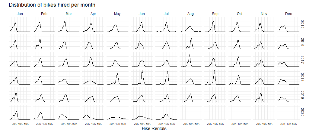
STEP2: Visualize the difference between real and expected monthly rent amount
# generate expected bike hired value for each month
bike_expected_month<-bike %>%
  filter(year>= 2016 & year <= 2019) %>%
  group_by(month) %>%
  mutate(expected_month_year=mean(bikes_hired, na.rm = TRUE)) %>%
  summarise(expected_mean=mean(expected_month_year))

# generate real bike hired value for each month in each year
bike_real_month<-bike %>%
  filter(year>=2017 & year<=2022) %>%
  group_by(year,month) %>%
  summarise(actual_hired=mean(bikes_hired))

# combine expected and real bike table
combine = left_join(x=bike_expected_month, y=bike_real_month, by = "month", all.x=TRUE) %>%
   mutate(min_1=pmin(actual_hired,expected_mean)) %>%
   group_by(year)

# graphing ribbon and line
h <- ggplot(combine, aes(x=month))
h+  geom_ribbon(aes(ymin=min_1, ymax=actual_hired ,group=year),fill="chartreuse4",alpha=0.25)+
    geom_ribbon(aes(ymin=min_1, ymax=expected_mean,group=year),fill="red", alpha=0.25)+
    geom_line(aes(y=expected_mean,group=year), color="blue",size=0.8)+
    geom_line(aes(y=actual_hired,group=year),color="black",size=0.2)+
    facet_wrap(~year)+
    labs(
    title = "Monthly changes in TfL bike rentals",
    subtitle = "Change from monthly average shown in blue
and caculated between 2016-2019",
    x = NULL,
    y = "Bike rentals",
    caption="Source: TfL, London Data Store")+
    scale_y_continuous(limits = c(10000,45000))+
    theme_minimal()+
    theme(text = element_text(size = 7))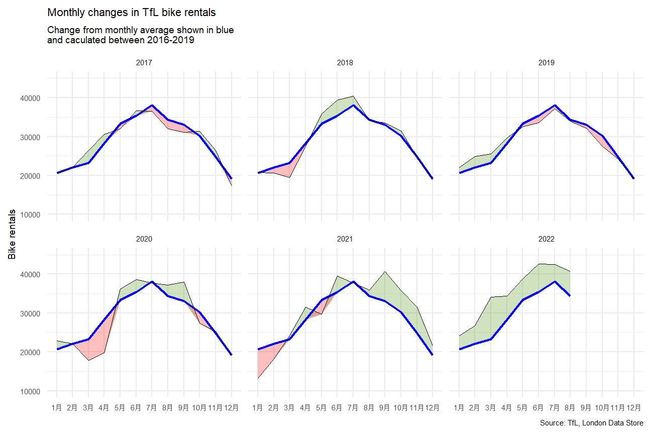
(mean are calculated by mean of monthly average from 2016 to 2019)
STEP2: Visualize the percentage changes from the expected level of real weekly rentals
# generate expected bike hired value for each week
bike_expected_week<-bike %>%
  filter(year>=2016 & year<=2019) %>%
  group_by(week) %>%
  mutate(expected_week_year=mean(bikes_hired)) %>%
  summarise(expected_mean=mean(expected_week_year))

# generate real bike hired value for each month in each week
bike_real_week<-bike %>%
  filter(year>=2017 & year <=2022) %>%
  group_by(year,week) %>%
  summarise(actual_hired=mean(bikes_hired))

# combine expected and real bike table
combine1 = left_join(x=bike_expected_week, y=bike_real_week, by = "week", all.x=TRUE) %>%
   mutate(change = (actual_hired - expected_mean)/expected_mean, rug_positive=ifelse(change>0, "col1", "col2")) %>%
   group_by(year) %>%
   filter(week < 52)                       # to limited the extreme value(the week 52/53 may cover next year)


# graphing ribbon and rug and line and rect
library(scales)     # library for percentage drawing
options(ggplot2.discrete.colour= c("chartreuse4", "red"))     # set the option for default factor color assignment
h <- ggplot(combine1, aes(x=week), options)
h+geom_ribbon(aes(ymin=pmin(change,0), ymax=0 ,group=year),fill = "red", alpha = 0.25)+
    geom_ribbon(aes(ymin=0, ymax=pmax(change,0),group=year),fill = "chartreuse4", alpha = 0.25)+
    geom_line(aes(y=change,group=year), size = 0.7)+
    geom_rect(aes(xmin=14,xmax=26),fill="grey", ymin=-1,ymax=1.5, alpha=0.01)+
    geom_rect(aes(xmin=40,xmax=52),fill="grey", ymin=-1,ymax=1.5, alpha=0.01)+
    geom_rug(aes(color = rug_positive), show.legend = FALSE)+
    scale_y_continuous(limits = c(-0.55, 1.05),labels = percent)+
    facet_wrap(~year)+
    labs(
    title = "Weekly changes in TfL bike rentals",
    subtitle = "% change from weekly averages
calculated between 2016-2019",
    x = "week",
    y = NULL,
    caption="Source: TfL, London Data Store"
  ) +
    theme_minimal()+
    theme(text = element_text(size = 7))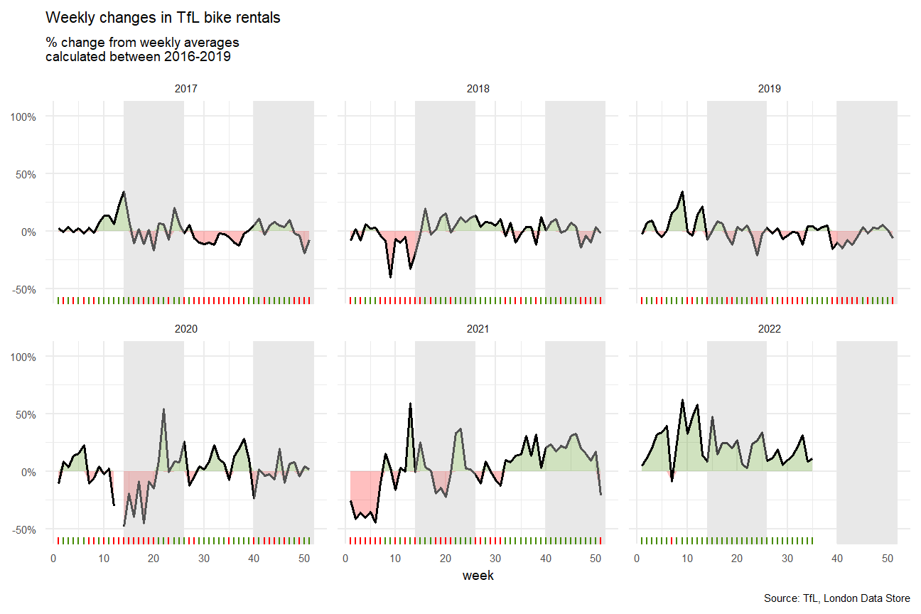
(Season 2 and 4 are presented as grey column)
STEP3: Conclusion and techniques summary
Case Analysis:
From the yearly TFL bikes rental amount change, we can see that since 2019 there is a general increasing trend of bike demand. This probably caused by the pandemic and London strike actions. And when the unlock and strike actions new announced, there will be an substantially increase in bike rental amount. In this case, TFL company could consider launch some new membership deal or season ticket pass to absorb more market share.
Programming Techniques:
Used massive tidyverse function to clean and edit data; used advanced ggplot function to visualize data, including geom_rug, geom_ribbon, geom_reg, and etc; used various aesthetic function to beauty the graph.
Logic of using Mean:
Normally, a mean is used as expected values and in this case, expected rentals. This applies to the cases where the distribution is not extremely unsymmetrical. From the diagrams above, we can see that the distributions are generally symmetrical. If there are cases where the distributions are extremely skewed and have clear outlines, median would be preferred as the value is less distorted.
Project 2:
Countries renewable development & CO2 emission per capital (Animation applied)
STEP1.1: Get and adjust raw data
technology <- readr::read_csv('https://raw.githubusercontent.com/rfordatascience/tidytuesday/master/data/2022/2022-07-19/technology.csv')

#get all technologies
labels <- technology %>%
  distinct(variable, label)

# Get country names using 'countrycode' package
technology <- technology %>%
  filter(iso3c != "XCD") %>%
  mutate(iso3c = recode(iso3c, "ROM" = "ROU"),
         country = countrycode(iso3c, origin = "iso3c", destination = "country.name"),
         country = case_when(
           iso3c == "ANT" ~ "Netherlands Antilles",
           iso3c == "CSK" ~ "Czechoslovakia",
           iso3c == "XKX" ~ "Kosovo",
           TRUE           ~ country))
skim(technology)| Name | technology |
| Number of rows | 491624 |
| Number of columns | 8 |
| _______________________ | |
| Column type frequency: | |
| character | 6 |
| numeric | 2 |
| ________________________ | |
| Group variables | None |
Variable type: character
| skim_variable | n_missing | complete_rate | min | max | empty | n_unique | whitespace |
|---|---|---|---|---|---|---|---|
| variable | 0 | 1 | 2 | 23 | 0 | 195 | 0 |
| label | 0 | 1 | 4 | 95 | 0 | 194 | 0 |
| iso3c | 0 | 1 | 3 | 3 | 0 | 238 | 0 |
| group | 0 | 1 | 8 | 11 | 0 | 4 | 0 |
| category | 0 | 1 | 5 | 27 | 0 | 9 | 0 |
| country | 0 | 1 | 4 | 32 | 0 | 238 | 0 |
Variable type: numeric
| skim_variable | n_missing | complete_rate | mean | sd | p0 | p25 | p50 | p75 | p100 | hist |
|---|---|---|---|---|---|---|---|---|---|---|
| year | 0 | 1 | 1.98e+03 | 3.47e+01 | 1820 | 1972.0 | 1993 | 2007 | 2.02e+03 | ▁▁▁▃▇ |
| value | 0 | 1 | 1.31e+09 | 4.43e+10 | 0 | 23.1 | 550 | 39768 | 8.82e+12 | ▇▁▁▁▁ |
| variable | class | description |
|---|---|---|
| variable | character | Variable name |
| label | character | Label for variable |
| iso3c | character | Country code |
| year | double | Year |
| group | character | Group (consumption/production) |
| category | character | Category |
| value | double | Value (related to label) |
(This data include about 200 technologies in more than 150 countries since 1800)
(data source National Bureau of Economic Research)
STEP1.2: Generate renewable energy data
#make smaller dataframe on energy
energy <- technology %>%
  filter(category == "Energy")
skim(technology)| Name | technology |
| Number of rows | 491624 |
| Number of columns | 8 |
| _______________________ | |
| Column type frequency: | |
| character | 6 |
| numeric | 2 |
| ________________________ | |
| Group variables | None |
Variable type: character
| skim_variable | n_missing | complete_rate | min | max | empty | n_unique | whitespace |
|---|---|---|---|---|---|---|---|
| variable | 0 | 1 | 2 | 23 | 0 | 195 | 0 |
| label | 0 | 1 | 4 | 95 | 0 | 194 | 0 |
| iso3c | 0 | 1 | 3 | 3 | 0 | 238 | 0 |
| group | 0 | 1 | 8 | 11 | 0 | 4 | 0 |
| category | 0 | 1 | 5 | 27 | 0 | 9 | 0 |
| country | 0 | 1 | 4 | 32 | 0 | 238 | 0 |
Variable type: numeric
| skim_variable | n_missing | complete_rate | mean | sd | p0 | p25 | p50 | p75 | p100 | hist |
|---|---|---|---|---|---|---|---|---|---|---|
| year | 0 | 1 | 1.98e+03 | 3.47e+01 | 1820 | 1972.0 | 1993 | 2007 | 2.02e+03 | ▁▁▁▃▇ |
| value | 0 | 1 | 1.31e+09 | 4.43e+10 | 0 | 23.1 | 550 | 39768 | 8.82e+12 | ▇▁▁▁▁ |
STEP1.3: Generate CO2 emission per capital data & Countries income level
# download CO2 per capita from World Bank using {wbstats} package
# https://data.worldbank.org/indicator/EN.ATM.CO2E.PC
co2_percap <- wb_data(country = "countries_only",
                      indicator = "EN.ATM.CO2E.PC",
                      start_date = 1970,
                      end_date = 2022,
                      return_wide=FALSE) %>%
  filter(!is.na(value)) %>%
  #drop unwanted variables
  select(-c(unit, obs_status, footnote, last_updated))
co2_percap_data<-skim(co2_percap)
co2_percap_data| Name | co2_percap |
| Number of rows | 5704 |
| Number of columns | 7 |
| _______________________ | |
| Column type frequency: | |
| character | 5 |
| numeric | 2 |
| ________________________ | |
| Group variables | None |
Variable type: character
| skim_variable | n_missing | complete_rate | min | max | empty | n_unique | whitespace |
|---|---|---|---|---|---|---|---|
| indicator_id | 0 | 1 | 14 | 14 | 0 | 1 | 0 |
| indicator | 0 | 1 | 38 | 38 | 0 | 1 | 0 |
| iso2c | 0 | 1 | 2 | 2 | 0 | 191 | 0 |
| iso3c | 0 | 1 | 3 | 3 | 0 | 191 | 0 |
| country | 0 | 1 | 4 | 30 | 0 | 191 | 0 |
Variable type: numeric
| skim_variable | n_missing | complete_rate | mean | sd | p0 | p25 | p50 | p75 | p100 | hist |
|---|---|---|---|---|---|---|---|---|---|---|
| date | 0 | 1 | 2004.55 | 8.64 | 1990 | 1997.00 | 2005.00 | 2012.00 | 2019 | ▇▇▇▇▇ |
| value | 0 | 1 | 4.32 | 5.51 | 0 | 0.57 | 2.38 | 6.31 | 51 | ▇▁▁▁▁ |
# get a list of countries and their characteristics
# we just want to get the region a country is in and its income level(total 4 levels)
countries <-  wb_cachelist$countries %>%
  select(iso3c,region,income_level)
countries_iclevel_data<-skim(countries)
countries_iclevel_data| Name | countries |
| Number of rows | 304 |
| Number of columns | 3 |
| _______________________ | |
| Column type frequency: | |
| character | 3 |
| ________________________ | |
| Group variables | None |
Variable type: character
| skim_variable | n_missing | complete_rate | min | max | empty | n_unique | whitespace |
|---|---|---|---|---|---|---|---|
| iso3c | 0 | 1 | 3 | 3 | 0 | 304 | 0 |
| region | 0 | 1 | 10 | 26 | 0 | 8 | 0 |
| income_level | 0 | 1 | 10 | 19 | 0 | 5 | 0 |
STEP2: Visualize the top20 highest and lowest % contribution of renewable energy in tatal energy production
#Energy Dataset converted to wide format and calculated % of renewable energy (rounded 3 decimal places)
energy_renew <- energy %>%
  filter(year==2019)  %>%
  select(c(variable,value,country)) %>%
  pivot_wider(names_from = variable, values_from = value) %>%
  mutate(perc_hydro=round(elec_hydro/elecprod, 3),
         perc_solar=round(elec_solar/elecprod, 3),
         perc_wind=round(elec_wind/elecprod, 3),
         perc_renew_other=round(elec_renew_other/elecprod, 3),
         perc_renew=round(perc_hydro+perc_solar+perc_wind+perc_renew_other,3)) %>%
  mutate(country=fct_reorder(country,perc_renew))

#Filtered data set for non-negative percentage and chose the bottom 20 countries followed by the graph formatting
energy_min_20 <- energy_renew %>%
  filter(perc_renew>0) %>%
  group_by(country) %>%
  summarise(perc_renew=sum(perc_renew)) %>%
  slice_min(perc_renew,n=20) %>%
  mutate(country=fct_reorder(country,perc_renew)) %>%
  ggplot(aes(perc_renew,country))+
  geom_col()+
  scale_x_continuous(labels=scales::percent)+
  labs(x=NULL,y=NULL)+
  theme_minimal() +
  theme(text = element_text(size = 7))

#Filtered data set for non-negative percentage and chose the top 20 countries followed by the graph formatting
energy_max_20 <- energy_renew %>%
  filter(perc_renew>0) %>%
  group_by(country) %>%
  summarise(perc_renew=sum(perc_renew)) %>%
  slice_max(perc_renew,n=20) %>%
  mutate(country=fct_reorder(country,perc_renew)) %>%
  ggplot(aes(perc_renew,country))+
  geom_col()+
  scale_x_continuous(labels=scales::percent)+
  labs(x=NULL,y=NULL)+
  theme_minimal()+
  theme(text = element_text(size = 7))

#Graphs are combined and labelled
energy_max_20 + energy_min_20 +
  plot_annotation(title = "Highest and lowest % of renewables in energy production",
                  subtitle = "2019 Data",
                  caption = "Source: NBER CHAT Database")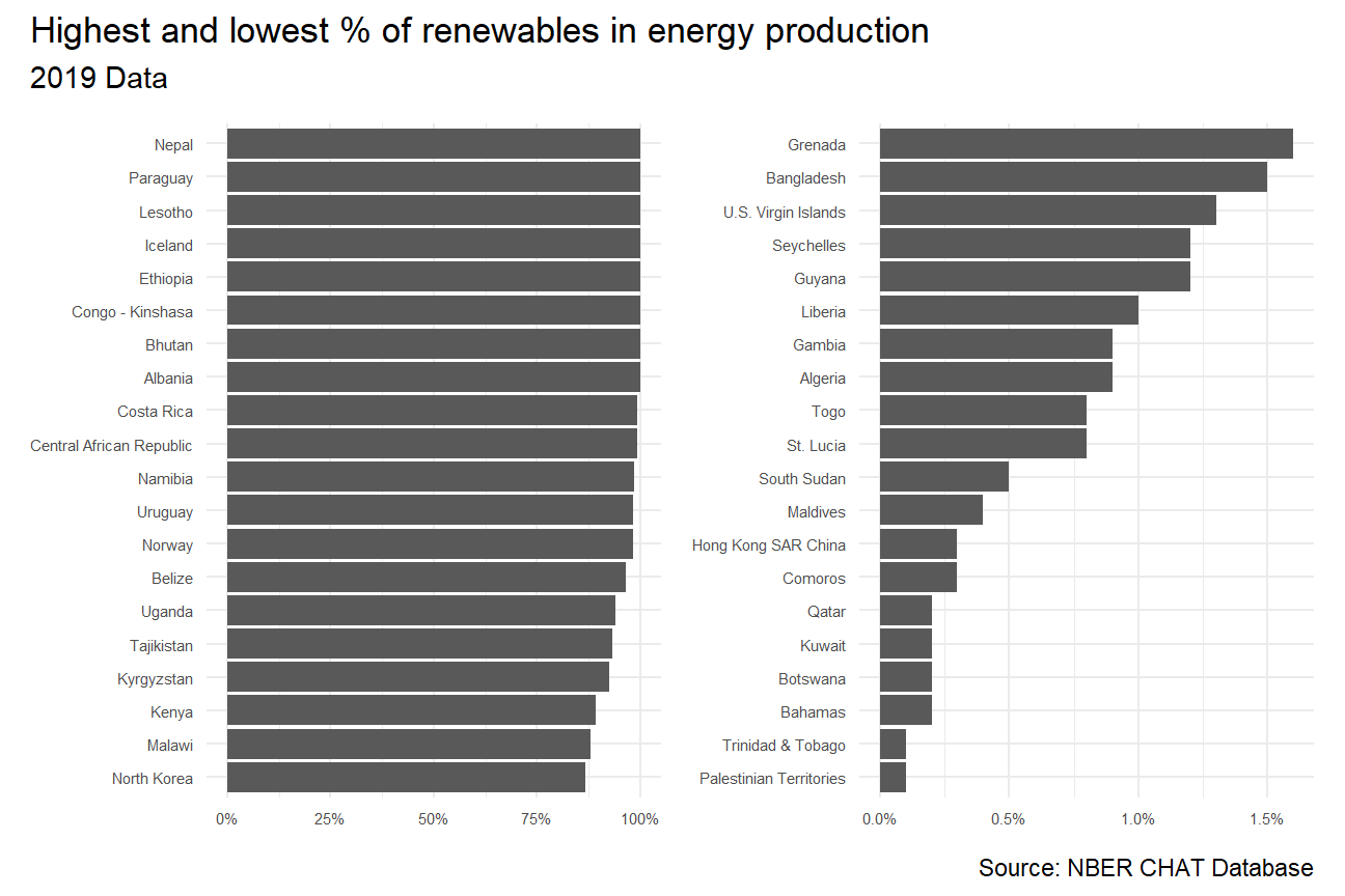
(Renewable production are summed up by elec_hydro, elec_solar, elec_wind, and elec_renew_other)
STEP3: Animate the relationship between CO2 per capital emissions and the deployment of renewable
#Create a pivot wider format and add new column
energy_perc <- energy %>%
  select(year, variable,value,country) %>%
  pivot_wider(names_from = variable, values_from = value) %>%
  mutate(percent_renew = (elec_hydro+elec_solar+elec_wind+elec_renew_other)/elecprod *100)

# Select only interested columns in energy chart
energy_perc_filtered <- energy_perc %>%
  select(year, country, percent_renew)

# Select only interested columns in co2 chart
co2_percap_filtered <- co2_percap %>%
  select(country, date, value, iso3c) %>%
  rename(year = date)

# Join the tables (energy, co2, and income_level)
energy_combined1 <- left_join(energy_perc_filtered, co2_percap_filtered, by = c("country", "year"))
energy_combined2 <- left_join(energy_combined1, countries, by = c("iso3c"))

# Create visualization (packages required)
energy_combined2 %>%
  mutate(year = as.integer(year)) %>%
  filter(year>=1990, !is.na(income_level)) %>%
  ggplot(aes(x=percent_renew, y=value, color = income_level))+
  geom_point()+
  theme_bw()+
  theme(legend.position="none")+
  facet_wrap(~income_level) +
  labs(title = 'Year: {frame_time}',
       x = '% renewables',
       y = 'CO2 per cap') +
  transition_time(year) +
  ease_aes('linear')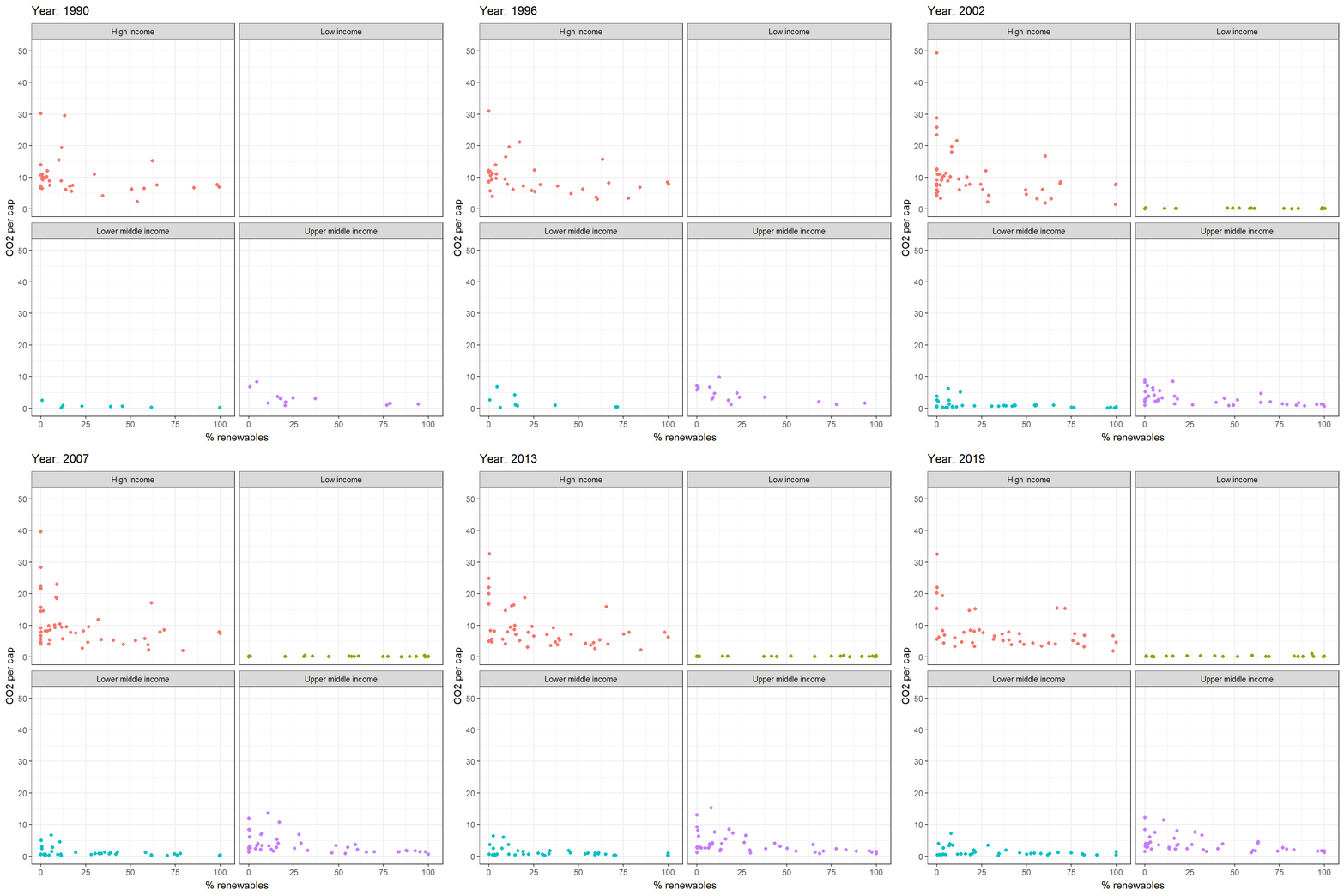
(year account from 1990 to 2020)
STEP4: Conclusion and techniques summary
Case Analysis:
From Highest and lowest % renewable production bar chart, we can see that the different countries energy production patterns are significant different in 2019, where the top countries can target over 75% renewable energy production, while the lowest 20 countries produced lower than 2% renewable energy.
From animation graph, we can visually roughly see a negative correlation between emission and usage of renewable energy (except low income countries). This may probably due to the entry barriers of renewable energy production as it is highly costly. Also, this finding would correspond to the common understanding on how renewable energy could be a vital factor in slowing down climate change.
Programming Techniques:
Used massive tidyverse function to clean and edit data; used advanced ggplot function to visualize and animate data, including transition_time, ease_aes, and etc; used various aesthetic function to beauty the graph.